SCROLL DOWN TO SEE THE WORK
Solve the puzzle to reveal the UX & UI Ai APP statement:
What term describes the cyclical process of refining a design through continuous user feedback and testing? *all lowercase letters*

Project Vision
Gaming Gears Vision is to revolutionize the way gamers shop for hardware and accessories by creating a platform that is intuitive, inclusive, and empowering. Aiming to simply shop, educate users, enable people to have a better experience, and connect gamers to one another. By focusing on user experience and accessibility, Gaming Gear aspires to be the go-to app for anyone looking to enhance their gaming experience from casual players to hardcore enthusiasts.
Project Overview
The Problem
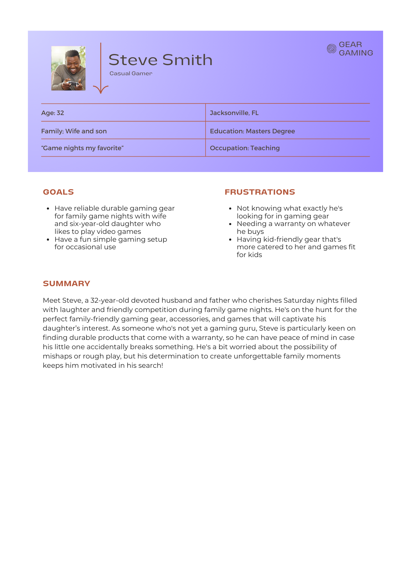
Customers who do not know exactly what tech and gear they need for the type of gaming they do and do not know what works with the gaming ecosystem they have already
The Goal
Try to help players make informed choices on tech and gear that fit their gaming style (casual player, a mid-core enthusiast, or hardcore gamer), as well as help customers, know exactly what they are getting and what works with the gaming ecosystem they already have in a timely matter.
USER EXPERIENCE RESEARCH
USER EXPERIENCE RESEARCH
For this project, I embraced a goal oriented approach, setting aside my previous assumptions about the industry. I conducted qualitative research that allowed me to dive deep into the experiences of our target personas. By starting with key questions, I aimed to uncover the challenges they face, adding a personal touch to foster empathy and understanding in my work.
Questions
What do our users need most?
What is the product and who is it for?
Why would a user need to use our app?
How can we make this an enjoyable experience?
I discovered that the most valuable data and insights came from the SME interviews I conducted. I transformed the most useful information into an affinity diagram and categorized everything into three actionable insights: Feature Prioritization, Design Enhancements, and Community Features. Recognizing and articulating the problems allowed me to focus on shaping user goals and understand how these goals would impact the business.

Affinity Mapping
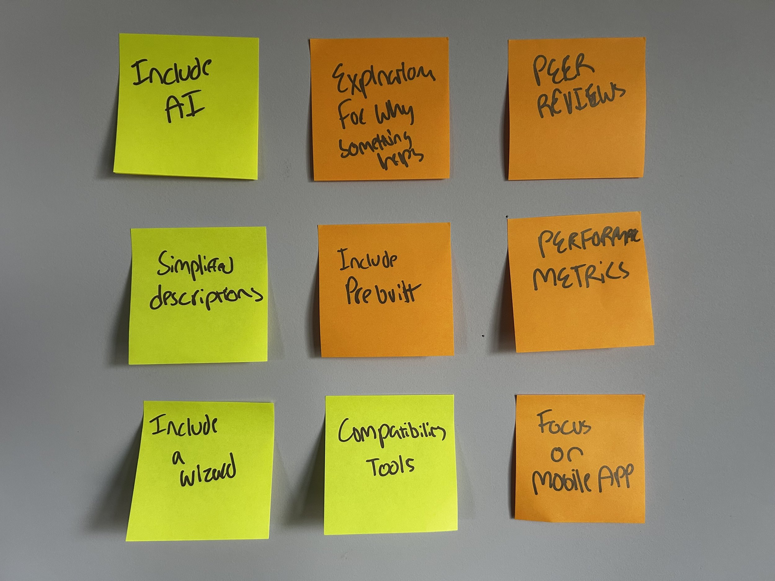
Possibe Solutions and Interation
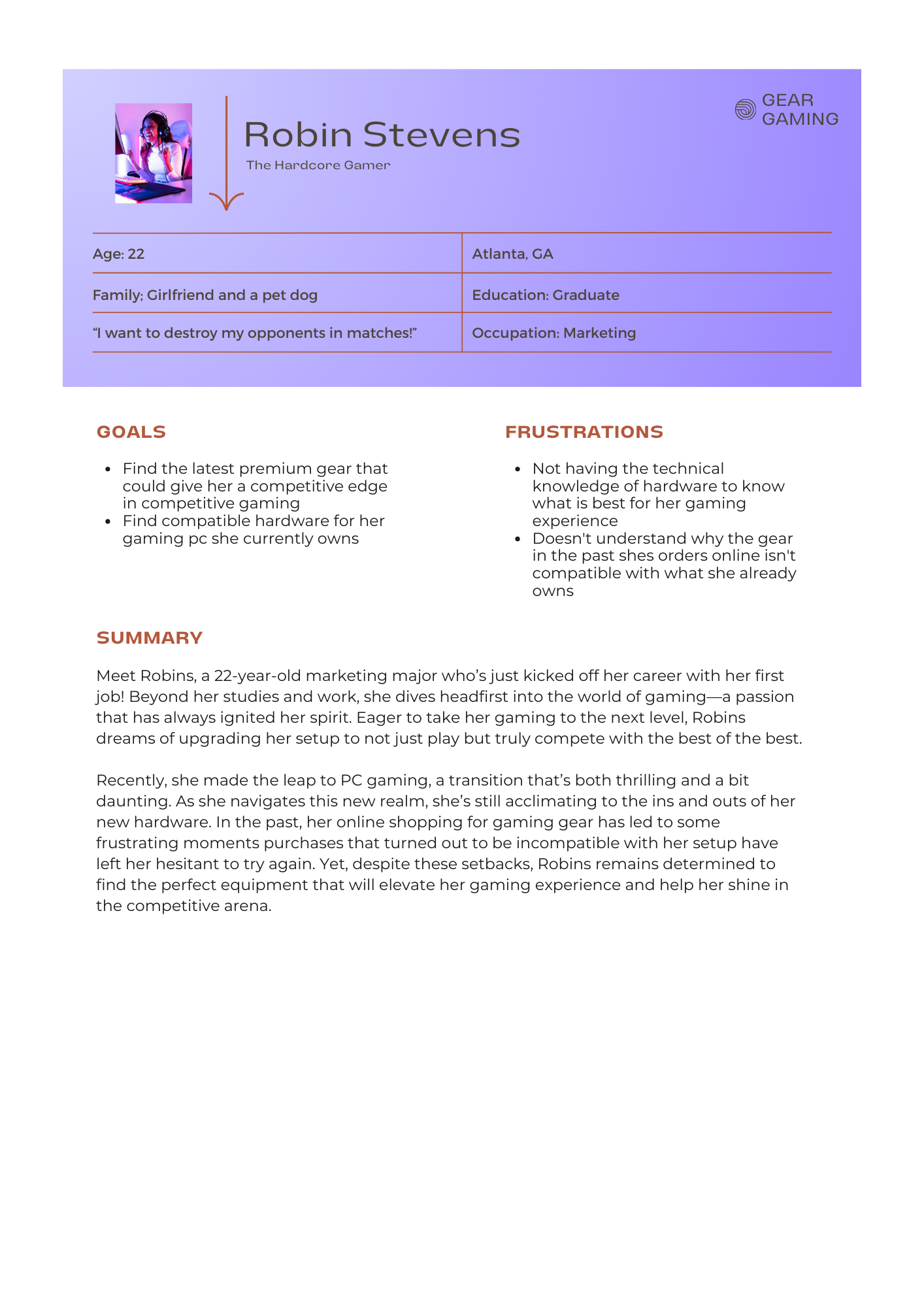
Meet the Users
Competitive Analysis
I planned to attract casual buyers, the app should offer personalized recommendations through filters or quizzes tailored to their needs and budget. Providing beginner guides and educational content will help first-time buyers understand technical terms and product compatibility. Streamlining user flow and navigation will create a more intuitive experience, and developing a dedicated mobile app will ensure seamless access across devices. Strengthening branding with a professional logo, consistent messaging, and a user-friendly interface will help establish a memorable identity. Integrating an AI assistant can further personalize support, simplifying decision-making for users. By focusing on creativity and innovation, the app can feature unique elements that stand out in the competitive gaming hardware market.


STARTING THE DESIGN
STARTING THE DESIGN
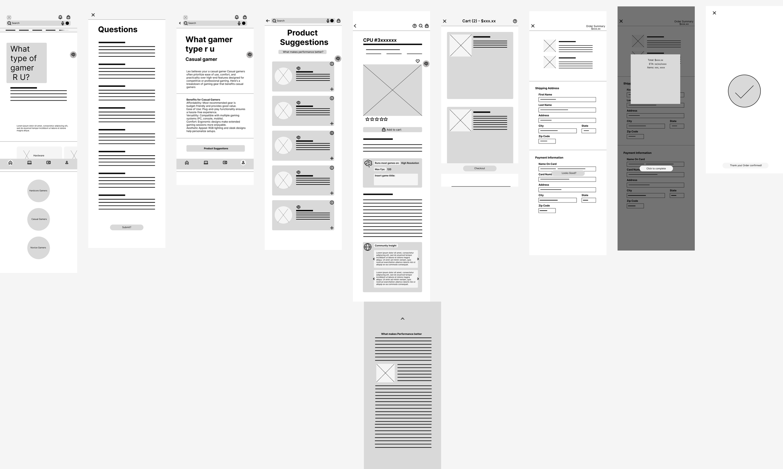
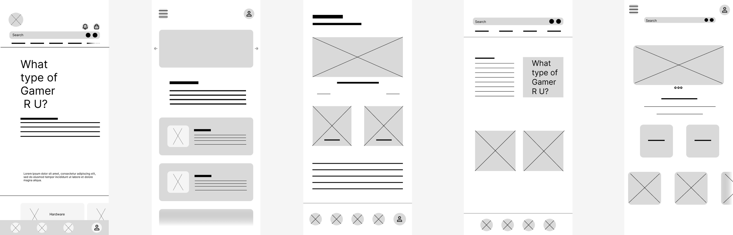
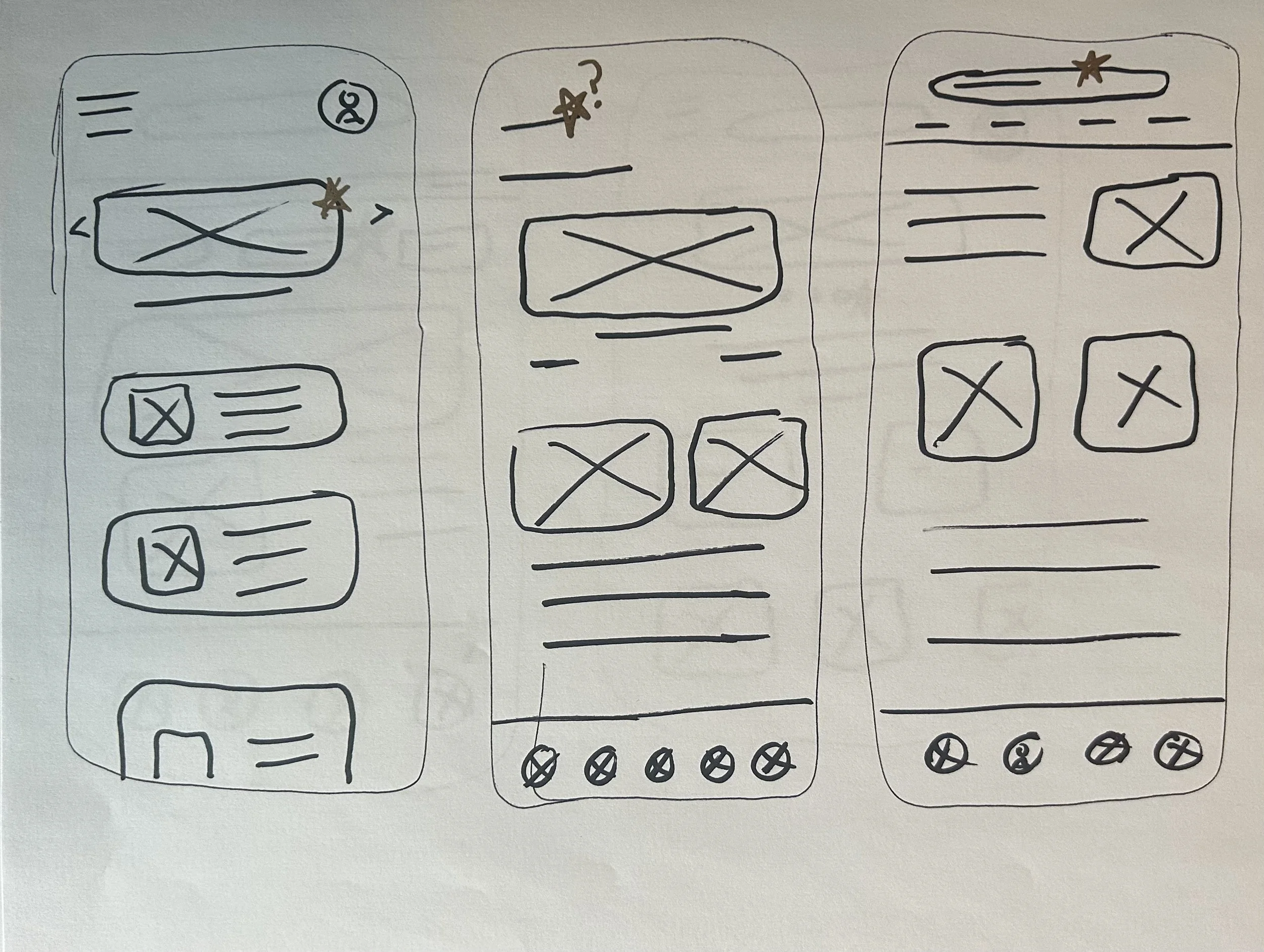
The goal was to plan effectively before investing time and energy into high-fidelity prototypes and mockups. I utilized my previous research on competitors and insights from interviews with SMEs to create an initial user flow chart. Using this flow chart, I developed several paper wireframes and narrowed them down to five designs. From there, I selected the best elements to create digital wireframes, ultimately resulting in the first low-fidelity prototype.
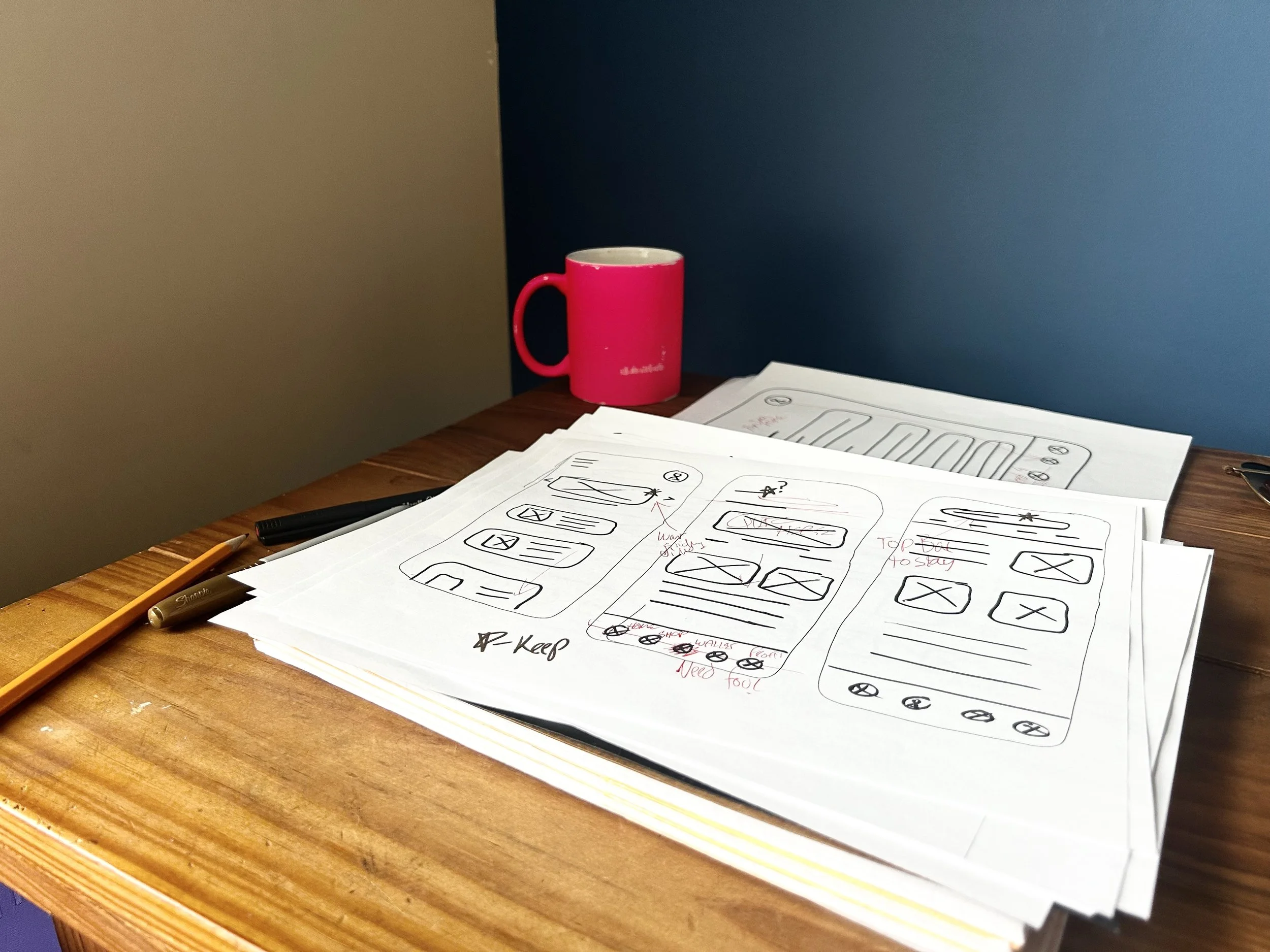
Paper Wireframes
To Digital Wireframes
ITERATION
ITERATION
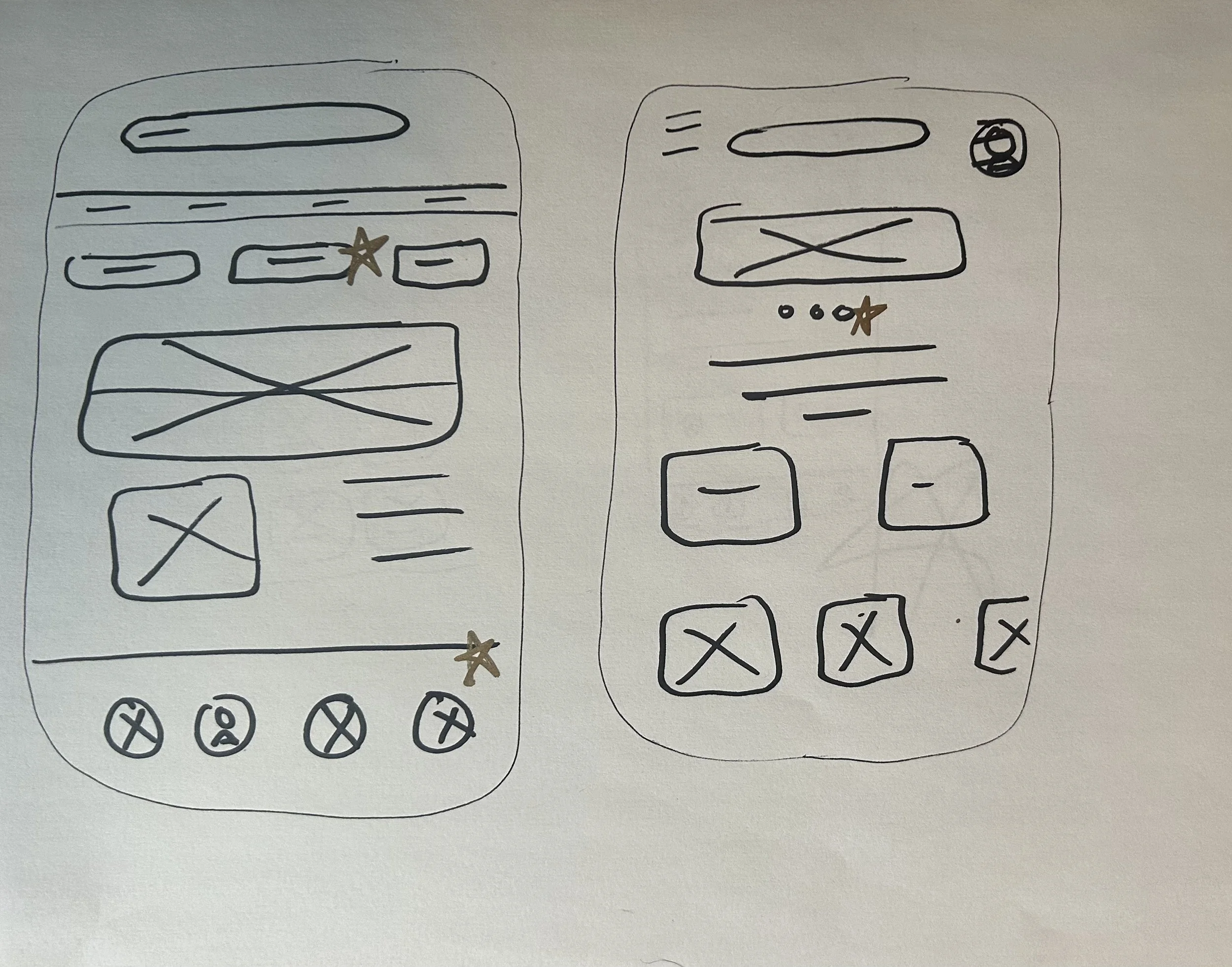
After the prototype was made from the low-fidelity wireframes I prepared questions for usability testing to gain insight into what could be done better to improve the app.
Common themes in responses
Icons felt out of place.
Confusing buttons on the home page, where do they go to?
Inconvenient to get to the cart after adding a product.
The specs indicator wasn't functional and didn't look as good as possible
Proposed Solutions
Adjust the size of the icons to fit the proportion of everything else.
Add a Suggestions heading above the three buttons on the home page.
Add a go-to cart button that appears instantly after adding something to the cart.
Add a search bar so that you can input what title you want and a slider for pixel definition.
Part of Style Guide
Header 01
Roboto Bold 40
Header 02
Roboto Semi bold 20
Header 03
Roboto Medium 32
Header 04
Roboto Regular 24
Body
Roboto Regular 10
Roboto Regular 12
Roboto Regular 14
#202346
#0F2D87
#3F0E8B
#DEC2ED
#A793EE