HIGH SOCIETY
DESIGNER


first design
When I joined High Society, I knew the brand needed a refresh but instead of jumping straight into a full redesign, I started by working with the existing logo. My first step was refining and modernizing the original, keeping its core identity intact while making it more polished and adaptable.
I adjusted the typography, improved spacing, and tweaked the design for better scalability across digital and print platforms. This phase allowed the brand to transition smoothly without losing recognition.
However, as I continued working with the brand, it became clear that a deeper rebrand was necessary. The old logo, even in its updated form, still had limitations. That’s when I decided to take the next step creating a completely new logo that better aligned with the company’s future.
This approach ensured continuity while also making space for innovation. The result? A logo that respects the past but embraces the future.
REDESIGNING
THERE OLD LOGO
OLD LOGO BEFORE
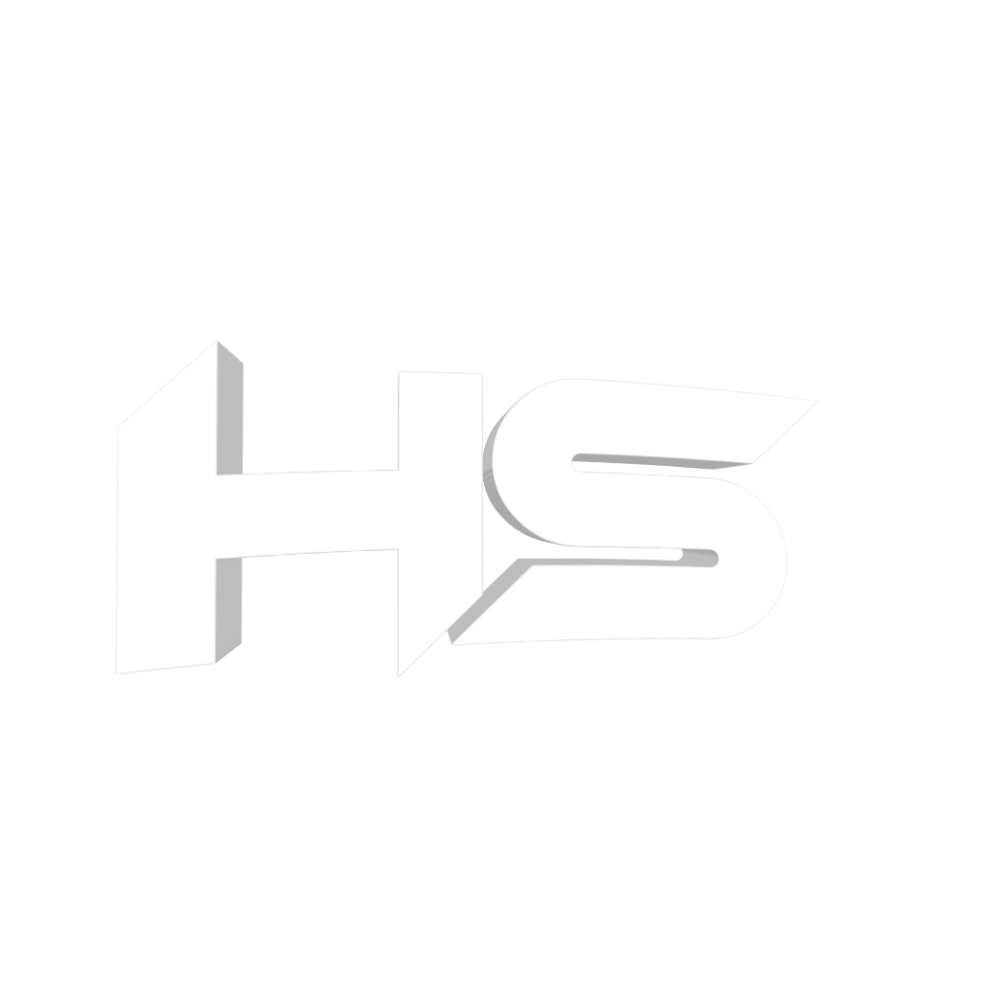
VERSION I CREATED
EXAMPLE OF A MY LOGO + DESIGN
Why I Rebranded the Logo
When I joined High Society eSports, I quickly realized that the logo, while meaningful, no longer reflected the brand’s growth and vision. It felt outdated, lacked versatility, and didn’t stand out in modern applications. A strong visual identity is crucial, and I saw an opportunity to elevate it.
Without being asked, I took the initiative to analyze the brand’s core values and audience. I reimagined the logo with a modern, refined design one that maintains the essence of the original but feels fresh, professional, and adaptable across all platforms.
This rebrand wasn’t just about aesthetics; it was about positioning High Society for the future while respecting its past. Seeing the transformation in action has been incredibly rewarding.
the
process
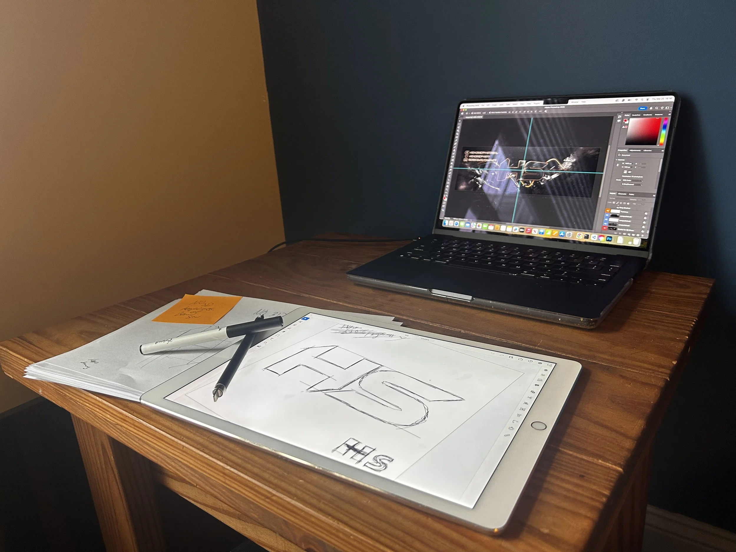
Every great design starts with an idea and for me, that meant going back to the basics: pen and paper. Before diving into software, I sketched out concepts, exploring different ways to modernize the existing logo while keeping its essence intact. This hands-on approach helped me refine shapes, balance proportions, and experiment with new ideas freely.
Once I had a direction I was happy with, I moved the design to my iPad, using digital tools to fine-tune details and test variations. Working in Adobe Illustrator, I refined the lines, adjusted typography, and experimented with different weights and layouts to ensure the logo would be versatile across all mediums.
The final result wasn’t just a new logo it was a carefully crafted visual identity that honors the past while setting the stage for the future. From the first sketch to the polished vector design, every step was intentional, ensuring a seamless transition into a modern, impactful brand.